Field-types reference
This page is a developer’s guide to how field types work: the shape every field’s config follows, what’s common to all of them, and how to read a generated options table. It is not the catalogue: for the full list of all 43 field types at the time of writing and every option each one accepts, see the field-types catalogue, which is generated in full from the same schema this page’s worked examples pull from.
The field-config shape
Section titled “The field-config shape”Every field entry (regardless of type) shares one common base, defined
once (BaseFieldConfig) and reused by all 43 types: label, handle, an
optional description, optional validation rules, an optional adornment
(pre/post icon and/or text rendered inside the input), an optional showWhen
conditional-visibility rule, and an optional triggersPreviewRefresh flag.
These are exactly the properties the generator strips out of every fragment
below before showing you what’s left, so a generated table only ever lists
what’s specific to that one type. (The Config Editor’s own visual form for
authoring a field splits this same base into flat inputs like “Show When
Field” / “Show When Value”: that’s an editor-UI convenience, not a different
schema; the YAML property is always the nested showWhen: { field, value }
shown on the config & YAML reference.)
What’s left after subtracting the base is type-specific config, and it comes in three shapes:
- Nested under
options, required. The type can’t function without its config:select,radio,checkbox,button-group,icon, andblock-paddingall require anoptionsobject. - Nested under
options, optional. Most other configurable types (number,link,wysiwyg,calendar, and so on) accept anoptionsobject with sensible defaults when it’s omitted. - Sibling properties on the field itself, not under
optionsat all. A handful of structural types carry their config as top-level keys next tolabel/handle/type:childrenandsections(sections, and forchildren,multiple),tabsandrepeater(a requiredfieldslist plus optionaloptions),hidden(value), andshortcode(placeholder).
And a fourth case: no type-specific config at all. Roughly a quarter of
the 43 types (text, email, password, switch, image, auto-uuid,
and others) accept nothing beyond the common base. Their generated fragment
is header-only.
Three worked examples
Section titled “Three worked examples”Each fragment below reflects the same generated data the full catalogue uses, not a hand-picked or hand-copied subset.
An option-bearing type: select
Section titled “An option-bearing type: select”select
| Option | Type | Required | Description |
|---|---|---|---|
display |
string: one of dropdown, transfer, combobox |
No | Visual variant for the select control. Defaults to 'dropdown'. |
multiple |
boolean |
No | When true, allows selecting more than one option. |
options |
FieldOption[] |
Yes | The list of selectable options. |
searchable |
boolean |
No | Enables a search/filter input within the options list. |
- label: Layout Variant handle: layoutVariant type: select options: display: dropdown options: - label: Standard value: standard - label: Compact value: compactAn optionless type: text
Section titled “An optionless type: text”text
No configuration options.
- label: Headline handle: headline type: texttext’s config is the common base and nothing else: the table above has no
rows because there’s nothing to add beyond label/handle/description/
validation/etc.
A non-options structural type: children
Section titled “A non-options structural type: children”children
| Option | Type | Required | Description |
|---|---|---|---|
multiple |
boolean |
No | |
sections |
SectionConfig[] or string |
No |
- label: Tabs handle: tabs type: children multiple: true sections: - label: Tab handle: tab fields: - label: Title handle: title type: textsections and multiple appear as their own rows because they’re config,
just not config that lives under an options: key. See
Nesting: children and sections
for what they mean.
Nested fields in the editor
Section titled “Nested fields in the editor”The three structural types that hold other fields (children, tabs, and
repeater) all expand inline in the editor rather than opening a separate
screen. A children field expands to a nested list of sub-sections:
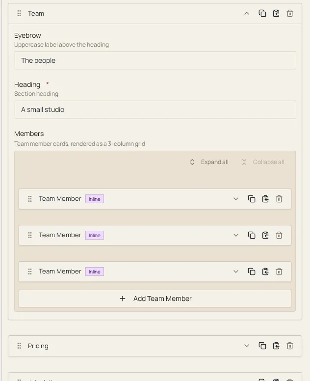
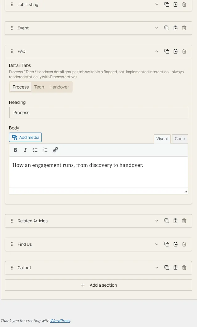
A tabs field expands to a tab strip, with only the active tab’s fields
shown at once:
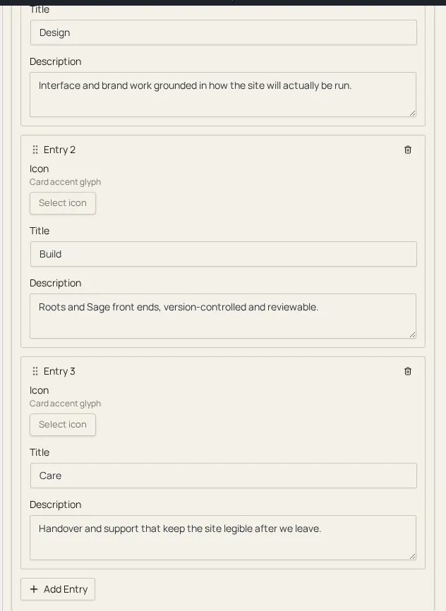
And a repeater field expands to a list of rows, each with its own copy of
the repeated fields plus add-row / remove-row controls:
Reading a generated table
Section titled “Reading a generated table”Every table has the same four columns:
- Option: the YAML key (under
options:, or a sibling oftypefor the structural shapes above). - Type: the value’s shape.
A or Bmeans either is accepted;X[]means an array ofX. - Required: whether the type can be used without setting this option.
- Description: pulled from the same source-code doc comment that documents the option to the editor’s own TypeScript, so it can’t drift from what the editor actually implements.
Where to go next
Section titled “Where to go next”- Field-types catalogue: every one of the 43 types, generated in full.
- Config & YAML reference: how a
field entry fits inside a section’s
fields:list. - JSON-Schema notes: the schema this whole generated reference is derived from.