Every field type SEK ships, grouped for navigability, with its options
table generated straight from section.schema.json. See JSON-Schema
notes for how. 43 field types at the time of
writing. A table with no rows means that type accepts nothing beyond the
shared base every field has. See the field-types
guide for what that base is and how to
read a table’s four columns.
text
No configuration options.
email
No configuration options.
password
No configuration options.
url
No configuration options.
textarea
| Option |
Type |
Required |
Description |
maxLength |
number |
No |
Maximum number of characters. Input is soft-capped at this length. |
minLength |
number |
No |
Minimum number of characters. Shown in the character-count indicator. |
number
| Option |
Type |
Required |
Description |
max |
number |
No |
Maximum allowed value. The input rejects values above this. |
min |
number |
No |
Minimum allowed value. The input rejects values below this. |
step |
number |
No |
Increment step for the stepper arrows and keyboard nudge. |
range
| Option |
Type |
Required |
Description |
defaultMax |
number |
No |
Default upper bound for dual mode. Only meaningful when dual is true. |
defaultMin |
number |
No |
Default lower bound for dual mode. Only meaningful when dual is true. |
defaultValue |
number |
No |
Default value for single mode. |
dual |
boolean |
No |
When true, renders two handles for selecting a range. |
max |
number |
No |
Upper bound of the slider track. |
min |
number |
No |
Lower bound of the slider track. |
step |
number |
No |
Snap increment for the handle(s). |
hidden
| Option |
Type |
Required |
Description |
value |
string |
No |
|
auto-uuid
No configuration options.
shortcode
| Option |
Type |
Required |
Description |
placeholder |
string |
No |
|
select
| Option |
Type |
Required |
Description |
display |
string: one of dropdown, transfer, combobox |
No |
Visual variant for the select control. Defaults to 'dropdown'. |
multiple |
boolean |
No |
When true, allows selecting more than one option. |
options |
FieldOption[] |
Yes |
The list of selectable options. |
searchable |
boolean |
No |
Enables a search/filter input within the options list. |
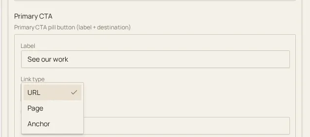
select’s default dropdown mode in the editor, representing the
closed-choice field types:
radio
| Option |
Type |
Required |
Description |
options |
FieldOption[] |
Yes |
The list of mutually exclusive options. |
checkbox
| Option |
Type |
Required |
Description |
options |
FieldOption[] |
Yes |
The list of toggleable options. |
switch
No configuration options.
| Option |
Type |
Required |
Description |
display |
string: one of icon, text, icon-text |
No |
Visual mode for the buttons. Defaults to 'text'. |
multiple |
boolean |
No |
When true, allows selecting more than one button. |
options |
FieldOption[] |
Yes |
The list of toggle-button options. |
svgPath |
string |
No |
Path to SVG sprite file. Required when display is 'icon' or 'icon-text'; each option’s icon property references a symbol ID within this sprite. Relative paths (no URL scheme, not starting with /) resolve against the active theme’s URL, the directory that holds .sek.yml, and a single leading ./ is dropped; absolute URLs and root-relative paths (/...) are used as given. The plugin resolves the path before the editor loads it; the YAML keeps the value as written. |
icon
| Option |
Type |
Required |
Description |
icons |
FieldOption[] |
Yes |
The available icons. Each entry’s value is a symbol ID within the sprite. |
searchable |
boolean |
No |
When true (the default), shows a search input to filter icons by label. Set to false to hide the search input. |
svgPath |
string |
Yes |
Path to the SVG sprite file containing icon symbols. Relative paths (no URL scheme, not starting with /) resolve against the active theme’s URL, the directory that holds .sek.yml, and a single leading ./ is dropped; absolute URLs and root-relative paths (/...) are used as given. The plugin resolves the path before the editor loads it; the YAML keeps the value as written. |
calendar
| Option |
Type |
Required |
Description |
format |
string |
No |
Date display format string (e.g. 'yyyy-MM-dd'). |
time
| Option |
Type |
Required |
Description |
format |
string |
No |
Time display format string (e.g. 'HH:mm'). |
datetime
| Option |
Type |
Required |
Description |
format |
string |
No |
Datetime display format string (e.g. 'yyyy-MM-dd HH:mm'). |
date-range
| Option |
Type |
Required |
Description |
format |
string |
No |
Date display format string applied to both start and end dates. |
These types hold other sections or fields rather than a scalar value. See
Nesting: children and sections.
tabs
| Option |
Type |
Required |
Description |
fields |
TabFieldConfig[] |
Yes |
|
showTitle |
boolean |
No |
When true, displays the tabs field label above the tab bar. Defaults to true. Set to false to hide the label. |
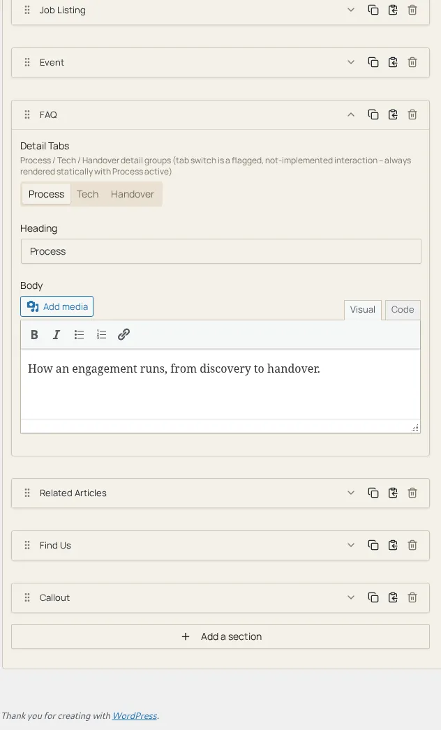
What a tabs field looks like expanded in the editor. Here’s the tab strip
plus the active tab’s nested fields:
tab
A tab field config entry, used exclusively inside a tabs field’s fields array.
| Option |
Type |
Required |
Description |
fields |
SectionConfigField[] |
Yes |
|
repeater
| Option |
Type |
Required |
Description |
collapsible |
boolean |
No |
When true, each repeater entry can be collapsed to save vertical space. Defaults to false. |
fields |
SectionConfigField[] |
Yes |
|
maxEntries |
number |
No |
Maximum number of entries the user can add. The “Add” button is disabled once this limit is reached. When omitted, no upper limit is enforced. |
minEntries |
number |
No |
Minimum number of entries required. When omitted, defaults to 0 (no entries required). |
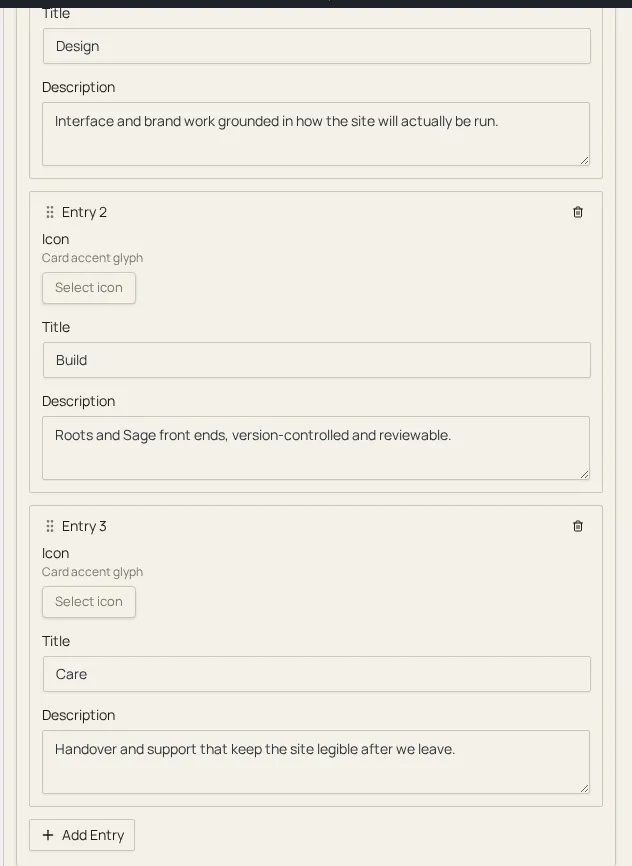
What a repeater field looks like expanded in the editor. Here are several
rows plus add-row / remove-row controls:
sections
| Option |
Type |
Required |
Description |
sections |
string[] or SectionConfig[] |
Yes |
|
children
| Option |
Type |
Required |
Description |
multiple |
boolean |
No |
|
sections |
SectionConfig[] or string |
No |
|
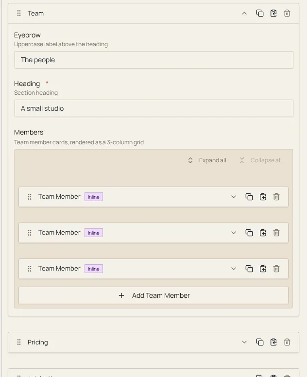
What a children field looks like expanded in the editor. Here’s a nested
list of the sub-sections/fields it contains:
section-picker
| Option |
Type |
Required |
Description |
sections |
string |
No |
|
global-section
Premium
No configuration options.
migration-path
No configuration options.
Structured values stored as real objects (or, for block-padding, an
array) rather than a plain string.
block-padding
| Option |
Type |
Required |
Description |
breakpoints |
FieldOption[] |
Yes |
Named breakpoints rendered as tabs. Each entry’s label is displayed in the tab bar and value is the breakpoint identifier used in the stored JSON and in defaults entries. |
defaults |
BlockPaddingEntry[] |
No |
Initial padding values per breakpoint. When omitted, all breakpoints start with empty start/end values. Only breakpoints listed here receive defaults; unlisted breakpoints remain empty. |
presets |
FieldOption[] |
Yes |
Preset padding sizes shown as selectable options for start and end values. Each entry’s label is the display name (e.g. “SM”) and value is the CSS length stored in the field data (e.g. '16px'). |
link
| Option |
Type |
Required |
Description |
anchors |
FieldOption[] |
No |
Named anchors available in the anchor picker dropdown. Each entry’s label is the display name and value is the anchor href (e.g. '#header'). Only relevant when 'anchor' is included in types. |
types |
string[] |
No |
Allowed link type modes. Each string corresponds to a tab in the link type switcher. Common values are 'url', 'page', and 'anchor'. When omitted, all types are available. |
address
| Option |
Type |
Required |
Description |
countries |
string[] |
No |
ISO 3166-1 alpha-2 country codes to restrict autocomplete results. When omitted, results are not filtered by country. |
placeholder |
string |
No |
Placeholder text shown in the autocomplete input before the user types. |
map
| Option |
Type |
Required |
Description |
defaultCenter |
object |
No |
Initial center coordinates when no pin has been placed yet. |
defaultZoom |
number |
No |
Initial zoom level for the map. Higher values zoom in closer. |
height |
number |
No |
Height of the map container in pixels. |
reverseGeocode |
boolean |
No |
When true, reverse-geocodes the pin coordinates into a formatted address string stored alongside the lat/lng. |
location
| Option |
Type |
Required |
Description |
countries |
string[] |
No |
ISO 3166-1 alpha-2 country codes to restrict autocomplete results. When omitted, results are not filtered by country. |
defaultCenter |
object |
No |
Initial center coordinates when no location has been selected yet. |
defaultZoom |
number |
No |
Initial zoom level for the map. Higher values zoom in closer. |
height |
number |
No |
Height of the map container in pixels. |
placeholder |
string |
No |
Placeholder text shown in the autocomplete input before the user types. |
image
No configuration options.
file
No configuration options.
gallery
| Option |
Type |
Required |
Description |
max |
number |
No |
Maximum number of images allowed in the gallery. The “Add” button is disabled once this limit is reached. When omitted, no upper limit is enforced. |
post-object
| Option |
Type |
Required |
Description |
placeholder |
string |
No |
Placeholder text shown in the search input. |
post_type |
string or string[] |
No |
WordPress post type(s) to search. Accepts a single string (e.g. "posts") or an array of strings (e.g. ["posts", "pages"]) to allow searching across multiple post types. When omitted, defaults to "posts". |
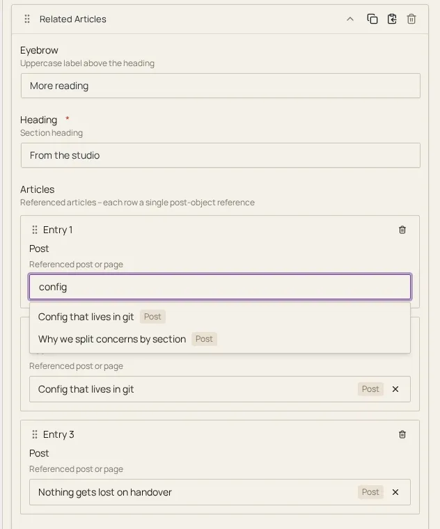
post-object’s search-and-select picker in the editor, representing the
relational/compound field types:
taxonomy
| Option |
Type |
Required |
Description |
multiple |
boolean |
No |
When true, allows selecting more than one term. |
placeholder |
string |
No |
Placeholder text shown in the search input. |
taxonomy |
string |
No |
WordPress taxonomy slug to query (e.g. "category", "post_tag", or a custom taxonomy slug). |
user
| Option |
Type |
Required |
Description |
placeholder |
string |
No |
Placeholder text shown in the search input. |
| Option |
Type |
Required |
Description |
placeholder |
string |
No |
Placeholder text shown in the menu selector. |
wysiwyg
| Option |
Type |
Required |
Description |
toolbar |
string |
No |
TinyMCE toolbar preset name. Controls which formatting buttons are available in the editor toolbar. |
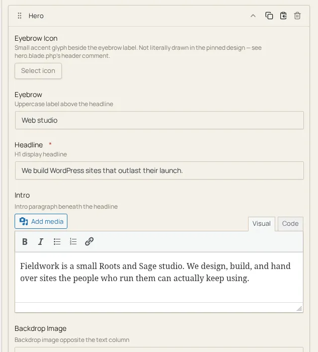
wysiwyg with its Visual tab active in the editor, representing the
rich-text field types:
oembed
| Option |
Type |
Required |
Description |
placeholder |
string |
No |
Placeholder text shown in the URL input. |
color
| Option |
Type |
Required |
Description |
freeform |
boolean |
No |
When true, enables the freeform hex color input alongside swatches. |
svgPath |
string |
No |
Path to SVG sprite file. Required when swatches use the icon property to display icons within swatch buttons. Relative paths (no URL scheme, not starting with /) resolve against the active theme’s URL, the directory that holds .sek.yml, and a single leading ./ is dropped; absolute URLs and root-relative paths (/...) are used as given. The plugin resolves the path before the editor loads it; the YAML keeps the value as written. |
swatches |
FieldOption[] |
No |
Predefined color swatches. Each swatch’s value is a hex color string. When swatches use the icon property, svgPath must also be provided. |
swatchesOnly |
boolean |
No |
When true, hides the freeform input and only allows swatch selection. |